This vignette is going to take you through conducting two simulations and then comparing the results with some visualizations. We’ll use ggplot2 to make the visuals here, but I’m not going to tell you how to live. The other package you’ll need, obviously, is meow.
No Exposure Controls
To do a simulation with no exposure controls, we’ll use the built-in item selection method, select_max_info(). To conduct a sample simulation using data generated from a 1PL and MLE based updates of , you can run:
out_none <- meow(
  select_fun = select_max_info,
  update_fun = update_theta_mle,
  data_loader = data_simple_1pl,
  init = NULL,
  fix = 'item'
)
Let’s look at some common ways you might want to visualize the results of your simulations. One thing to note, is that the last line of out_info$results is going to have the final bias values for each parameter in the simulation, so we’ll focus on examining their evolution over time.
Root Mean Squared Error (RMSE) of Person Abilities
First, we’ll extract just the results dataframe. Since we’ll be combining this with an exposure control method later, I’ll also label it:
results_none <- out_none$results |>
  mutate(control = 'None')
Next we want to extract the bias in the person abilities. We can also grab the current estimates if we like. Just change the suffix you select from _bias to _est.
results_none |>
  select(iter, control, starts_with('pers_')) |>
  select(iter, control, ends_with('_bias')) |>
  pivot_longer(ends_with('_bias'), names_to = 'person', values_to = 'bias') |>
  group_by(iter, control) |>
  summarize(rmse = sqrt(sum(bias^2)), .groups = 'drop') |>
  ggplot(aes(x = iter, y = rmse, color = control)) +
  geom_line() +
  labs(
    x = 'Number of Items Delivered',
    y = 'RMSE for Person Ability',
    color = 'Exposure Controls'
  ) +
  theme_minimal() +
  theme(legend.position = 'bottom')
This is more useful when comparing across methods, though. Now let’s take a look at how individual parameter trajectories evolve over time. Again, we’ll track the bias.
results_none |>
  select(iter, control, starts_with('pers_')) |>
  select(iter, control, ends_with('_bias')) |>
  pivot_longer(ends_with('_bias'), names_to = 'person', values_to = 'bias') |>
  ggplot(aes(x = iter, y = bias, color = control, group=person)) +
  geom_line(alpha=0.4) +
  labs(
    x = 'Number of Items Delivered',
    y = 'Bias in Estimated Person Ability',
    color = 'Exposure Controls'
  ) +
  theme_minimal() +
  theme(legend.position = 'bottom')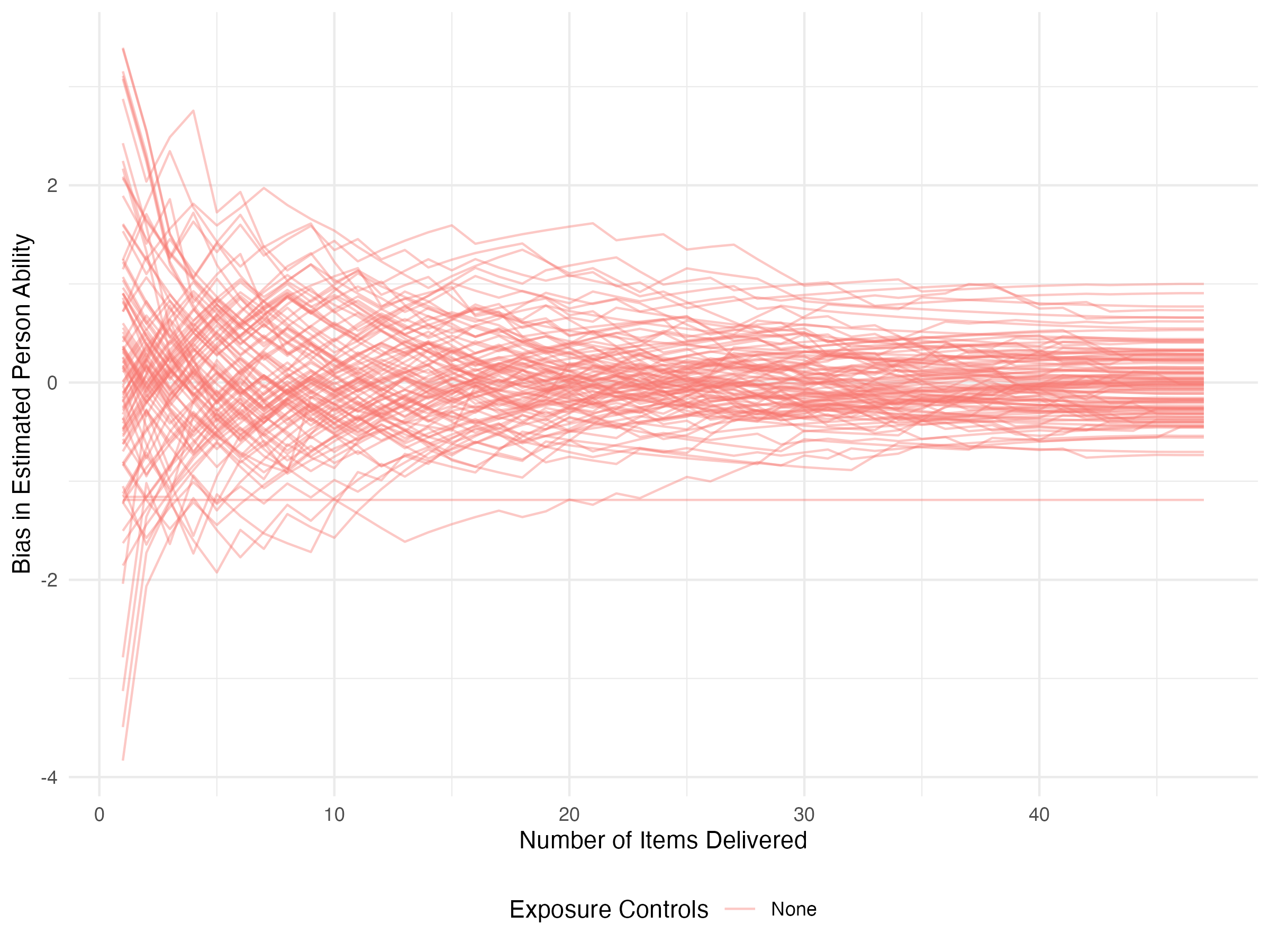
Restricting Item Exposure
This is quite similar to the unrestricted case, it just involves two additional steps and an additional parameter that needs to get passed to the selection function. First we need to compute exposure rates for all administered items, and then second, we need to drop potential items that are above the current exposure rate.
The diagonal of the adjacency matrix has the exposure counts, so from that we quickly compute exposure rates and then filter potential solutions based upon that.
select_rest <- function(
  pers,
  item,
  resp,
  resp_cur = NULL,
  adj_mat = NULL,
  r_max = 0.025
) {
  if (is.null(resp_cur)) {
    return(resp[resp$item <= 5, ])
  } else {
    r_obs <- data.frame(
      item = item$item,
      r_obs = diag(adj_mat)/sum(diag(adj_mat)), row.names=NULL
    )

    resp_new <- dplyr::anti_join(
      resp,
      resp_cur,
      by = c('id', 'item', 'resp')
    ) |>
      dplyr::left_join(pers, by = 'id') |>
      dplyr::left_join(item, by = 'item') |>
      dplyr::left_join(r_obs, by='item') |>
      dplyr::filter(r_obs < r_max) |>
      dplyr::mutate(
        info = .data$a^2 *
          stats::plogis(.data$a * (.data$theta - .data$b)) *
          (1 - stats::plogis(.data$a * (.data$theta - .data$b)))
      ) |>
      dplyr::slice_max(.data$info, n = 1, by = .data$id) |>
      dplyr::select(.data$id, .data$item, .data$resp)
    resp_new <- dplyr::bind_rows(resp_cur, resp_new)
  }
  return(resp_new)
}
To pass an exposure rate to the item selection function that’s different from the default value, we can conduct a simulation that looks like this:
out_rest <- meow(
  select_fun = select_rest,
  update_fun = update_theta_mle,
  data_loader = data_simple_1pl,
  init = NULL,
  fix = 'item',
  select_args = list(r_max = 0.02)
)
Now let’s say we want to compare the RMSE in estimated abilities over time for the two methods. We can bind together the rows for our two outputs (making sure that we’ve labeled our control method) and plot as before:
results_rest <- out_rest$results |>
  mutate(control = 'Restricted')

results <- bind_rows(
  results_none,
  results_rest
)

results |>
  select(iter, control, starts_with('pers_')) |>
  select(iter, control, ends_with('_bias')) |>
  pivot_longer(ends_with('_bias'), names_to = 'person', values_to = 'bias') |>
  group_by(iter, control) |>
  summarize(rmse = sqrt(sum(bias^2)), .groups = 'drop') |>
  ggplot(aes(x = iter, y = rmse, color = control)) +
  geom_line() +
  labs(
    x = 'Number of Items Delivered',
    y = 'RMSE for Person Ability',
    color = 'Exposure Controls'
  ) +
  theme_minimal() +
  theme(legend.position = 'bottom')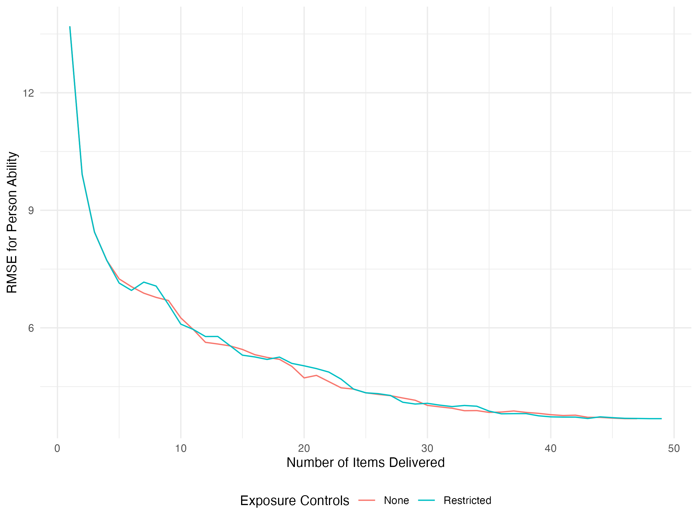
Here we can see that, as it turns out, restricting item exposure doesn’t hurt our RMSE too much. What about the individual parameter trajectories? Here we’ll separate the two using faceting. We’ll also only look at these trajectories over the first twenty items.
results |>
  select(iter, control, starts_with('pers_')) |>
  select(iter, control, ends_with('_bias')) |>
  pivot_longer(ends_with('_bias'), names_to = 'person', values_to = 'bias') |>
  filter(iter <= 20) |>
  ggplot(aes(x = iter, y = bias, color = control, group=person)) +
  geom_line(alpha=0.4) +
  labs(
    x = 'Number of Items Delivered',
    y = 'Bias in Estimated Person Ability',
    color = 'Exposure Controls'
  ) +
  facet_grid(control ~ .) +
  theme_minimal() +
  theme(legend.position = 'bottom')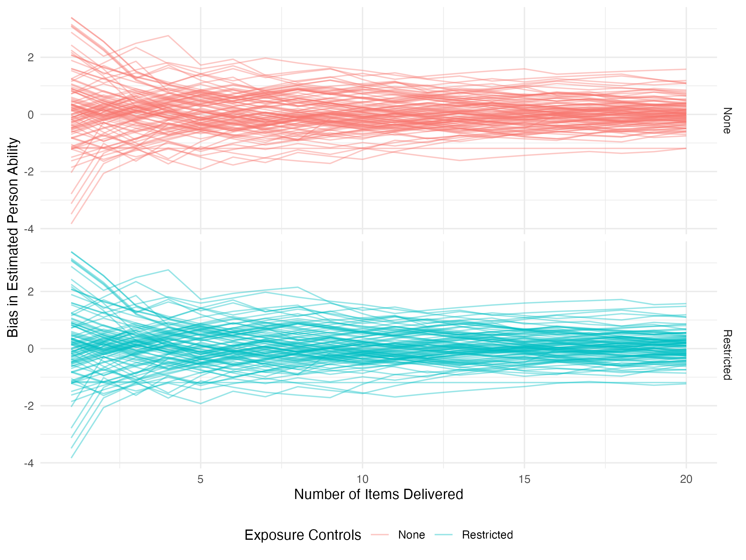
Early on, the trajectories are identical because exposure controls haven’t yet kicked in. We didn’t see much difference in the RMSE plot, and here we continue to not see much difference.
Visualizing the Adjacency Matrix
One thing you can also do is create interactive visualizations of the evolution of the adjacency matrix. This is really helpful for getting a sense of how your exposure controls or selection algorithms might be impacting item utilization. You’ll need two packages to do this, statnet for creating the network objects and ndtv for creating the dynamic visuals.
The first thing you’ll need to do is create a network list. We do this by calling the network() function from statnet onto each object in the adjacency matrix list. The output from meow is formatted to make this as easy as a single lapply():
rest_nets <- lapply(out_rest$adj_mats, network)Next we collapse these into a single dynamic network object. We do this with a call to networkDynamic(). Again, our output is structured to make just visualizing these as simple as possible.
dyn_rest <- networkDynamic(network.list = rest_nets)Finally, we render the movie. This will, by default, open a browser window with an interactive movie. Here we’ve embedded an HTML object. In it, you can click on specific nodes to get more information about them or follow them over time, move forward and backward through time, and also zoom in and out. We’ve also added some information about item difficulty. Items with difficulties below zero (easier) are colored blue, while harder items are colored red. Additionally, the size of the nodes is larger the farther they are from zero. This makes it quick to identify the easiest and hardest items as the largest nodes. An illustrative thing to do is click on the hardest item (the largest red node) and see what it gets connected to over time.